Monday, November 7, 2011

Tekkon Kinkreet by Taiyō Matsumoto

I really didn't know what I was getting into with Tekkon Kinkreet. I really didn't. Unlike our previous books, this series itself isn't an adaptation of previous material; it's its own story with an animated adaptation.

And the story itself is... it's an amazing blend of elements melded together into one big wrecking ball that will shatter you. Well, maybe it won't, but I sure enjoyed it. A pair of homeless boys named Kuro and Shiro (Black and White in the English localization) rule in the Takara district of a large Japanese city. They're referred to as the Cats, prowling the streets without a care and doing what they will. This is their city and Black makes it clear, having his violent way with those who rub him the wrong way and taking their money. This is his territory and he doesn't like others intruding. The local police and mob know this and leave the pair alone, but one day a new gang intrudes under the guise of gentrification. And this gang doesn't care about the established rules. The city is changing, renovations are sneaking in and old institutions are being replaced. Black and White are swept up in this change, but the city doesn't care.

In the beginning Black tells White to "come, it's play time." This is the perfect introduction to the story. The first chapter is the kind to make you realize just how important the first chapter of a story is in establishing it. It's a wonder to see the author stick through to the end to what's been established and also how the characters have developed. White wonders why he begins to feel sad when the sky turns black. Black reassures him that no one will ever break them cause they're all just junk.

Taiyō Matsumoto's art is pleasure to look at. In a discussion he states that he sees the art mainly as a tool to deliver the story and he tailors the style to suit his stories. It's obvious that he succeeds here. You can see that here is a man who know how to draw and stretches the limits. The lines have a quality to fit the mood, the city bends around the characters, and when Taiyō wants to draw action, he hits it smack on the head. It is spectacular.
"Don't you worry, Shiro. No one's going to break us."

As for the animated adaptation by Studio 4°C, from when Black first tells White it's play time transitioning into the flying scene with the city panorama, I get the impression that I'm in for a good haul like the comic. And visually, the studio delivers. The city itself is as much a part of the story as the characters, so I was interested in seeing how it would be depicted. The studio blows this out of the water, rendering the city and blending it amazingly with the 2D animation. You can tell they're having fun with the designs and the abilities of their software. Studio 4°C's reputation is well-deserved.


Oh yes, this is going to be good.
Now onto the negative parts. Reading the comic first, I definitely have a certain "voice" for each character. The voice itself, but also how the characters speak and deliver, their nuances. It's all there in my mind. A successful transition from panel to screen needs a good voice behind it. It needs to agree with the readers' image of the original source character or convince them that this version on screen is suitable if not better. Of course this is subjective. But at least the main voices are great. Black and White work, and the others suffice. Kimura though really doesn't sit with me (And Chocolate was a wreck). I read and watched this in the original Japanese so I can't say how the English voices work.

The adaptation as a whole is pretty straightforward. The various chapters of the books are condensed into little segments which are then cut-pasted and rearranged in the film. The dialogue is almost entirely pulled verbatim from the comic. It's a little jarring sometimes as it seems like a blitz of little tidbits, and I don't know how viewers not knowing the characters will manage remembering said tidbits. I had a good first impression but this slowly soured as I realized the film wasn't taking its own path and rather was cramming the entirety of the 600-something pages into less than 2 hours. Visually it is absolutely stunning. Story-wise, I don't know what the director was thinking. Why does this series even need to be crammed into a single film? That's taken away so much from this story it's a shame. Any strength in the film's story is the strength of the original source material. I don't see much of anything the director's improved upon in his adaptation besides the visuals. Some of the decisions you can understand and others you wonder why they were made. The drama for one definitely suffers.

You have to admire the director's persistence in delivering this film, and with such style. Maybe it's because I chose to watch this after reading the manga that the delivery falls so flat. I already know every twist and turn, and I don't get as much time to be acquainted with the characters. They're gone before I've gotten to know them. Some of the cast, mainly Kimura, don't do the original characters justice. The drama is rushed. I can't take my time to digest anything before we move on to the next course. It starts off running and doesn't let you stop to rest. By the time the second half rolls around I'm a little tired. This film might actually be better watched in two or three installments.

The comic is definitely up there. It's the sort of comic where I wonder if there's some sort of deeper message and meaning. I usually don't care about that sort of thing, but this comic makes you want to look deeper. And then I slap myself on the head and say "shut up, stop thinking, and enjoy the ride." The film adaptation is still good but reading the comic first ruined much of the experience for me. Don't read the book then watch the film the day after. Give it some time before watching the film or vice versa.


Also kind of funny that, I finished reading this before realizing that, the title is completely unrelated. Well maybe not completely since people like to look at the title which means reinforced concrete in Japanese (but jumbled) and pull some meaning out of it. The source of the title though is because the author kept on pronouncing tekkin konkreet (reinforced steel) as tekkon kinkreet as a child.

Crumb Documentary

I masturbate to my own drawings. What can I say?

Sunday, October 23, 2011

Richard Corben's Haunt of Horror: Lovecraft and Lovecraft: Fear of the Unknown

So H.P. Lovecraft is pretty damn influential. Richard Corben is apparently kinda big too, working a lot in Heavy Metal magazine and other various comics. I know Corben as "that guy whose stuff I hated on Hellboy and I hope he never works on Hellboy again but alas." Personal opinion.


Funny thing is, these are the same expressions I make whenever I see Corben's faces.

So I hated Corben in Hellboy. I still do. Imagine my surprise when I read that he's kinda known and some influential creators really dig his stuff. Times like this I wonder if I'm missing something that's obvious to all the others out there praising. Opinions are more persuasive when accompanied with reasoning (to be fair the same applies to negative criticism, and probably some of my blog posts). God forbid I listen to a bunch of people praising something then decide to praise and like it myself. A quick skim through Corben's wikipedia page and we get a "Quotes about Corben" section (maybe there are others who think like me and need persuading), followed by what is indeed a list of quotes by many prominent figures in related fields, all praising Corben's work. And mostly being a bit ambiguous; vague.

"He works with towering technical skill..." -Will Eisner
"He put stuff into his comix that the overground press wouldn't print." -Robert Crumb
"I was very struck by the visceral punch they had, by the unusual artistic point of view. And also by the unabashed exaggeration. It's as if you wanted a woman to have big breasts, you drew it." -Frank Miller
"Corben's technique introduced the airbrush to comics. His sophisticated knowledge of how color is printed allowed him to get fantastic results. His work has maintained a sense of humor and spectacle in tales of barbarians, time travelers and Arabian nights." -Harvey Kurtzman

So these are about as specific as the quotes get. The rest are about Corben's stuff being "great" or about Corben himself being "a genuine giant of his chosen medium", etc. Of course this is just a quick look on wikipedia and I could spend more time researching Corben's decades of work, but that's not gonna happen. So I'll work off of what others more familiar with his work say. And what I read tells me that Corben is: technically brilliant, familiar with print, exaggerates his proportions, and introduced airbrushing to comics. Oh, and he's funny? I guess.

Looking through his art in Haunt of Horror and Hellboy I can start to see where these people are coming from. We can see the experience in his art and his work with colors is great. What I don't get is why does his exaggeration with the human face and body have to be so ugly? I took a look on his website biography and saw that "Corben has regularly attended life drawing sessions throughout his career." So why do his people look like such ass? The self-portrait painting on the biography page looks fine, and I even looked on his Figure Gallery page. This is where I got my answer. Corben can actually draw people fine.

It all makes sense now! (c) Richard Corben
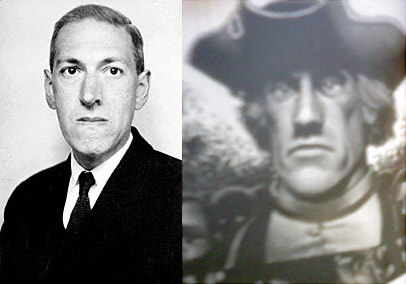
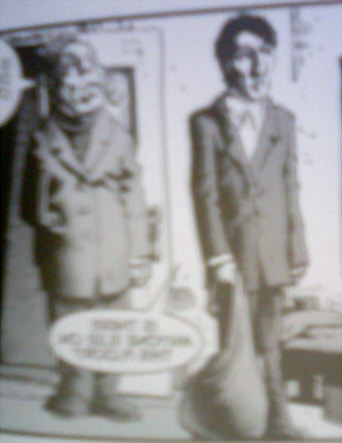
What I can't get over in Corben's art are his people. Yes I've said this already. But in particular I refer to how he chooses to depict faces, figures, and fingers. Oh god his fingers. When they don't look normal-ish those pudgy sausages bother me. And his figures. I don't know why. I just don't. I think most of the time this probably isn't the case but it's the worst examples that stick with me and flash through my mind. His faces though are the constant. They are what first alerted me that something was amiss, and they are what tell me "crap, it's Corben." It's funny, cause for some reason his faces in Haunt of Horror aren't as bad. Another funny thing is they're proportionally similar to how Lovecraft's mug was.
Have we met? (Incidentally the pirate on the right actually looks okay.)
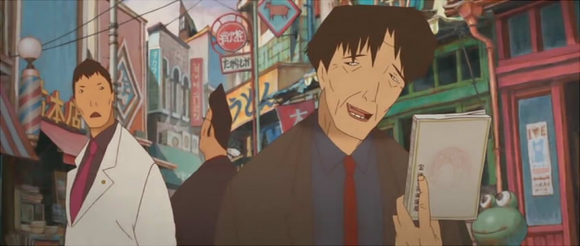
So I've rambled on enough about Corben. Let's talk about Haunt of Horror. It's actually not bad. Not particularly horrifying either though. Corben takes liberties with the source material. The short stories are trimmed into comic form and the poems are extended into short story form. Sometimes it works and sometimes it doesn't. What I think though is that somehow Corben's delivery of the serious, horrific twists turn into punchlines too often. Sometimes from cheesiness, others because of "wait, what?" moments. In Dagon I actually laughed at how ridiculous the last 3 panels were. And Corben remains true to Lovecraft's first person form, but there's a problem with his usage of thought bubbles when the thoughts don't read well or smoothly. And that's about as much Corben as I want to stomach in a day.


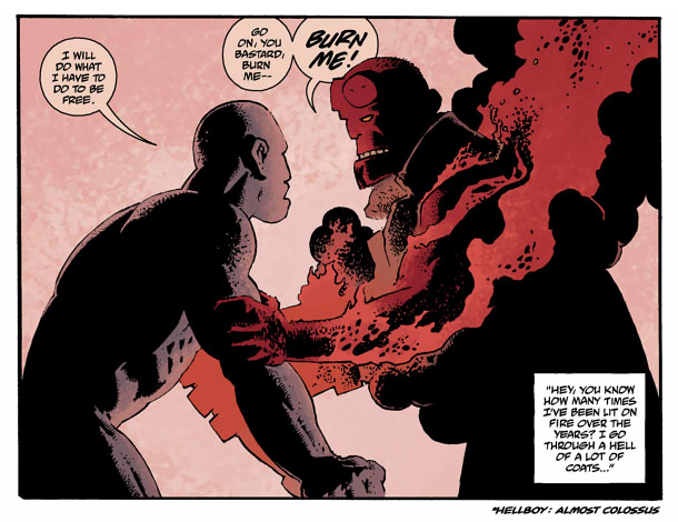
Actually a pretty cool panel from Hellboy: Being Human.
Oh right, yeah, there's the documentary Lovecraft: Fear of the Unknown. Pretty straightforward, it gives a pretty in depth look at Lovecraft's life and influences and spends some time trying to explain Lovecraft's xenophobia. But this is a documentary as much about Lovecraft's work as the man himself and talks at length about the Cthulhu mythos. Stylistically it attempts to bring some of the mythos' flavor. The film is entirely in black and white and features a soundtrack and narration to fit the mood. The information the film provides can mostly be found on wikipedia (well, maybe not the analysis of Lovecraft's writing style), which sort of renders the point of the documentary moot when you can spend less time on the wiki and learn just as much. Where the film becomes interesting is in its interviews with modern day creators who are fans of the mythos and pulled inspiration from it. Neil Gaiman, Guillermo del Toro, and John Carpenter are probably the most known names who speak on Lovecraft, but there are plenty more who contribute their thoughts.

I don't know if this documentary is one someone new to Lovecraft should watch as it reveals much about his writing that would probably be best discovered through actually reading his works. Probably better to watch when you've been acquainted with his works in some way, and if you're well versed on Cthulhu you probably don't need to watch the documentary (just skip to the interviews).
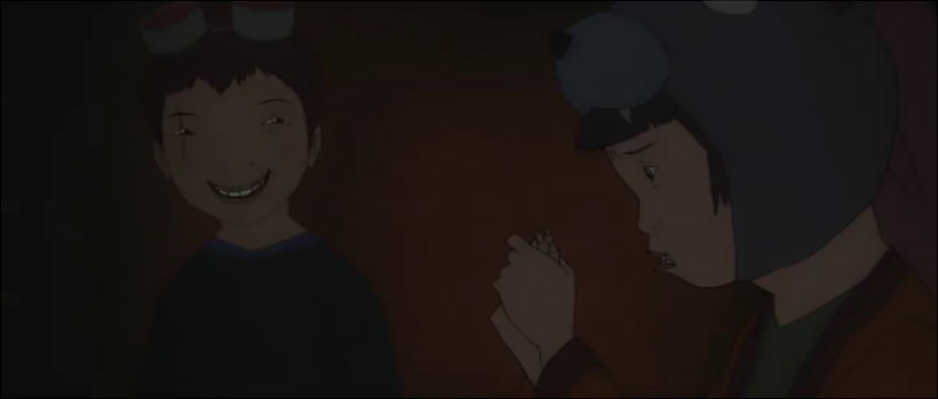
Tuesday, October 18, 2011

Selected Bible Segments

So this weekend was pretty crazy at New York Comic Con/Anime Fest. Probably not just for me but everyone else in the class too. My friend came down from Wellesley to table at NYAF Artist Alley with me, which was pretty fun. She made a killing doing quick ink portrait caricatures for $5 a piece (really underselling herself in my opinion). Her prints did pretty well too, particularly one of My Little Pony in Adventure Time fashion shown here (http://shainareads1001books.tumblr.com/post/9493049908/d-im-thinking-of-changing-the-caption-on-the-top)
I basically played second fiddle to my friend, handling her sales when she was too busy doing portraits and barely selling any of my own prints. I did get some sketch commisions in, so those were fun. And I met some other cool artists, which was great.

I'm getting sidetracked. I'm actually treating this like a blog and not just somewhere to post my ill-conceived thoughts on comics. So, to the point of this post: comparing Crumb's Genesis and parts of The Wolverton Bible to their source, the Bible. Both are relatively straightforward adaptations. Both artists approached the task with respect, and the parts we're looking at (Genesis 3-5, 25-27, 37-47, Revelations 1-3, 19-23) aren't particularly detailed or evocative. I've already compared how Wolverton and Crumb each approach the job, so it's easy enough to scroll down the page to those posts.
My friend from Wellesley says I probably shouldn't compare Wolverton, Crumb, and Chwast's work to Dürer and Doré's. She has a point. I probably shouldn't have. Oh well.
Since both Wolverton and Crumb work pretty straightforward from the text, we can see that they worked with what they had. Genesis is relatively barebone, probably leading to some of the boring scenes I criticized in both Wolverton and Crumb's books. With Revelations though, we get some descriptive imagery, leading to some of the better pictures in Wolverton's Bible. What I like to see in adaptations are artists taking the limits placed and stretching as far as they can with those limits.
With the sketch requests I received at the artist alley, some of them were pretty simple, to-the-point (Big McIntosh from My Little Pony as a space marine) and others gave me more freedom for interpretation of their request (a halfling paladin in crystalline armor with angel wings, youthful face, flowing hair, and a claymore). I enjoyed both types of commisions, so being reminded of that is fun.

Tuesday, October 4, 2011

Dante's Divine Comedy Adapted by Semour Chwast

I'm not quite sure what Seymour Chwast was trying to do with his adaptation of Dante's Divine Comedy. He's not trying to show his faith like Wolverton, and he's not trying to lay it all out on a plate like Crumb. Well, yes, his attempt does seem more similar to Crumb's. But without the labor put into the art. I mean, goddamn. This art is so simple it's... I was able to breeze through the book within an hour, the art was so simple. The dearth of text helped too.

So what was Chwast trying to do? Dumb it down and make a Divine Comedy for Dummies? His art does have a fun quality, and the humor he injects into the narrative through Detective Dante's comments do lighten the mood. It's definitely not Hell that he's illustrating--it's not nearly as depressing or horrifying as it should be. When I was in Florence, I remember picking up another illustrated copy of the Divine Comedy, by Gustave Doré. Masterful engravings. The cover illustration of thieves suffering punishment by serpents almost made me want to turn my head away (to be fair, after some experiences in Europe I do think some thieves deserve being tortured alive by snakes). But Doré's version was still rather boring (from what little I saw) and I put the book down after thumbing through a few pages.


Yeah Doré snakes! Punish those thieves for the wallet they took from my friend in Barcelona! I'd say punish those con artists in Barcelona too if they weren't burning somewhere else for fraud!

Were it Doré I might agree with Detective Dante. But since it's Chwast it might be sarcasm.

If you like snakes, feel free to steal all you want!

The art quality of Chwast is crude, simple, and a little pleasant. It reminds me of Evan Dahm's art for Rice Boy. But worse. Jules Feiffer is also brought to my mind, but Chwast's work isn't nearly as delightful as Feiffer's. In the end, I'm still wondering what was the point in Chwast's adaptation of The Divine Comedy.

Wednesday, September 28, 2011

Quick, Short, Not Particularly Well-Structured Addendum for R. Crumb's The Book of Genesis

While reading this book, I thought what would happen if you gave it to someone with no knowledge of the Bible and had them read it as a secular piece? What would they say about the plot, the story, the characters, the god?
With the Bible I've gotten to the point that I just don't plain care. It also helps that I'm not a religious person or overly familiar with the Bible. I know the main stories but not the details. So it helps that Crumb chooses to scour through the lines of Genesis and depict many of the details that may be lost to readers.
In an interview with Allen Salkin (http://www.nytimes.com/2009/10/18/arts/design/18salk.html?ref=design), Crumb comments on a number of things about his Genesis. I found Crumb's thoughts on his work to be infinitely more interesting and revealing than a good chunk of his book. But I'm interested in the pre-production and production aspects of things, so I find it fascinating when creators talk of their process and the reasoning behind their choices. (I begged to my animation instructor and he let me borrow his copy of Dream Worlds: Production Design for Animation by Hans Bacher. God damn this book strikes me down in awe.)
Right off the bat, he says, “I was intrigued by the challenge of exposing everything in there by illustrating it. The text is so significant in our culture, to bring everything out was a significant enough purpose for doing it.”
Before I was focused more on how he presented the content rather than what he presented. How it looked and delivered rather than what it was trying to say. There have been more than a few times in his book where I thought some things just didn't make sense. Also some parts that read like a cheap drama (Genesis is full of men pretending to be their wives' brothers, standing idly as their beautiful "sisters" are taken by kings, then enjoying the riches they receive in compensation as divine intervention reveals to the kings that they were on the verge of committing adultery; men being absolute dicks; women being petty and jealous; and ugly people). Crumb talks to Noah, who he shows as in constant shock at God's decision to suddenly kill the world. When I read this portion, I was thinking how clueless Noah looked. Now that I know he's supposed to be in shock, things make more sense. And it does. Noah was the one good man left in the world according to God. I would think a good man would be concerned for the well-being of other men even if they are bad people according to God. A good man wouldn't condone genocide. Unless of course it was his god doing it. And after the flood, when Noah offers a burnt sacrifice to God, God smells it and is moved to declare that never will he commit genocide again. For Crumb, this "doesn’t quite add up somehow." Yet he chose to be true to the scene rather than manipulating the narrative to show the reader his misgivings.
Another aspect I talked about before was how ugly Crumb's people are. And Crumb himself actually says in his interview with Salkin that he's "not very good at drawing attractive women actually." While I'm sure there are people who find his women attractive, I think he's spot on in this assessment of his own work. And I think we can see from his depiction of Genesis and from his responses in the interview that Crumb is an honest man. He delivers the book in a low key, humble way, something I interpreted as playing it safe. I still kind of do, for the repetition in the artwork is mind-numbing. The short section on composition in Bacher's Dream Worlds alone blows away everything in Crumb's Genesis. After reading Crumb's commentary on The Book of Genesis, I realize that he's trying to present Genesis to readers in a fashion for them to interpret themselves.

Monday, September 26, 2011

R. Crumb's The Book of Genesis

Following The Wolverton Bible is R. Crumb's The Book of Genesis. Crumb states a number of things in the introduction, things helpful in foreshadowing what one can expect from the book. What I point to specifically are two instances:

"I, ironically, do not believe that the Bible is 'The Word of God.' I believe it is the words of men."
"I approached this as a straight illustration job, with no intention to ridicule or make visual jokes."

Just as Crumb believes the Bible to be "the words of men," his illustrated Genesis is the scribblings of a single man, a mundane and down-to-earth interpretation that, at the end of the day, I don't have much to say about. I managed to churn out a rant when given The Wolverton Bible, but Crumb's Genesis is altogether drab. I can leave this book in a corner to gather dust or toss it in the trash, as opposed to Wolverton's, where I would maybe cut out a few choice scenes to save then positively incinerate the rest of the book.

Crumb is conservative in his illustrations. And it's something he acknowledges. He doesn't see the Bible as something to mess around with and treats it so. I'm not familiar with his other work, but from what I can see in this book, Crumb's expressions aren't terribly expressive. He doesn't show a terrible lot of variety in his art; all of the supposedly attractive women are round and chunky with ugly wide lips, brows are constantly furrowed (and that's about as expressive as they get), and the panels almost never depict scenes with more than a handful of people (I think the battle in the Valley of Siddim was the one with the most, and that was only 1/6th of a page). There's more I can tick off, but Crumb falls into the same rut Wolverton did: repetition, staleness. It doesn't help that the constant lines of text make me feel that I'm actually reading the textual Genesis rather than something which is supposed to be illustrated.

Now let's do some comparing. Wolverton and Crumb. They're similar in that I'm not a fan of either. I think they're both ugly. Crumb does however seem to show a higher level of technical proficiency in his anatomy, even though his "attractive" women rarely are (When Adam and Eve were frolicking in the brush it took me a while to figure out who was who. This should never be the case with the first man and woman). Wolverton on the other hand shows a greater level of care in his cross-hatching. Crumb's shading at its worst looks lazy and careless. Sometimes it works and sometimes it doesn't. It works for the details he puts on the logs making up Noah's Ark, it's absolutely brilliant for the fires raining down upon Sodom and Gomorrah, but it falls flat whenever he shades naked thighs. (Try and guess which sort of scenes show up more in this book.) His crosshatched flesh doesn't work in other situations, but the thighs are what get to me. In every sexual scene in the book, my eyes weren't taken by the actual sex (I'm sorry, Crumb's women are too ugly. His men are ugly too, but that wouldn't matter in any case.) but rather how the crosshatching on the thighs and flesh looked horrible.

Style aside, we can look at their depictions of the Bible. The Wolverton Bible was a compilation of his illustrations organized in a sort of logical way. It's not terribly successful, but at least Wolverton's illustrations try to tell stories individually, and he did take the time to do some more grandiose scenes (some of the better stuff in his book). Crumb's pictures are boring. He's letting the words do the talking, not the pictures themselves as much. In the end I feel that Crumb was rather too conservative in his depiction of Genesis, much as a child watching a documentary might suddenly stand up and say, "this is supposed to be about a war. Where are the explosions!?" I mean, I was bored. I'm surprised I even got through it. But I guess it's only fair after sludging through The Wolverton Bible.

The Wolverton Bible is a man trying to show the glory and wrath of his god and tripping a good amount of the time.
R. Crumb's The Book of Genesis is a man playing it safe. I'm reminded of an episode of Hell's Kitchen where Gordon Ramsay scolds a team (I think it was blue) for creating a menu that was too safe and not challenging enough. I don't recall which season it was.
Crumb believes the Bible to be "the words of men." This belief is reflected in his own delivery of the text, in both his depiction of God and of men. I would elaborate, but it's late.